The Bold & Beautiful
- Raini
- Jan 21, 2023
- 2 min read
2023 is expected to be an exciting year for interior design!
Many things contribute to the shifting of trends. However, it is believed that the global pandemic that kept us inside our home (more than we may have liked), is a significant factor in the trends we are seeing for the upcoming year – or years - to come.
As far as color trends go, bright and bold hues are expected to be popular in the coming year. Folks are seeking ways to make a statement in their home – and paint is a simple and inexpensive way to make a quick and powerful change. Vibrant blues, pinks, reds, and oranges are likely to be popular color choices for those looking to make an impact.

Previously we introduced Biome from the Sherwin Williams Colormix® 2023 collection, which is composed of 40 trend colors across four palettes, inspired by the natural interweaving of ourselves and our spaces. Today we are looking at the palette titled Origin. This selection of 10 colors embodies the mix of bright and bold hues, softened with restful neutrals, that are anticipated to be used not only in paint, but also furnishings and accessories.

To chart a path through the wild and wonderful landscape of our lives, we begin within. By layering our fondest memories and future hopes, we create vibrancy and joy in the present moment. Recharge with color that keeps making a comeback— free-spirited brights, magnetic deeps, and a whisper of restful neutrals.
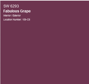
These vibrant colors offer a fresh take on adding color to a space without being overbearing. While purple would not be my first choice for most clients, this color blocked accent wall in Fabulous Grape (SW6293) is a splendid example of how color can be used in a way that does not overwhelm the room.
If Origin is a little to bold for you (often we are more comfortable adding color in more subtle ways), there are two other palettes in the Colormix® collection. Nexus offers soft serenity with a potter’s palette of natural clays and sunbaked desert sands, grounding brown, and soft, soulful white. While Lore is an intricate mix of ancient reds, powdery pastels, and a bevy of bejeweled tones. #sherwinwilliams #colormix2023
Before making any decisions on paint color, consider what kind of mood or atmosphere you want to create. Then, begin to explore some of the color options that will help you achieve that goal.
Color theory may be a little intimidating to some readers. If this is the case, you may want to use a design professional to walk you through the process. Assuring the appropriate undertone is selected to coordinate with any fixtures or furnishings you are keeping in the space is essential.
If you find your head spinning, or your eyes are glazing over at figuring out what undertone, hue, or complementary colors are, book 15-minute discovery call with Raini & Associates – that’s our jam!
Adding color to your space should be fun and exciting – and 2023 is the time to embrace it!


Comments